The Boston Foundation Rebrand
My role | Creative Direction | Photography | Cinematography | Brand Strategy | Logo
Move Equity. Move Boston.
Our new brand illuminates the action we know is needed to disrupt, dismantle and repair the systems of inequity. We recognize that to move the needle and power a better Boston it is imperative that we move equity forward. Our central brand idea–or Brand Truth–Move Equity, Move Boston serves as our anchor. This central idea is both an invitation and a promise; that when we collectively take action to advance equity and close the gaps of our city’s disparities we not only improve lives, we build a stronger, better Boston.
Brand Application
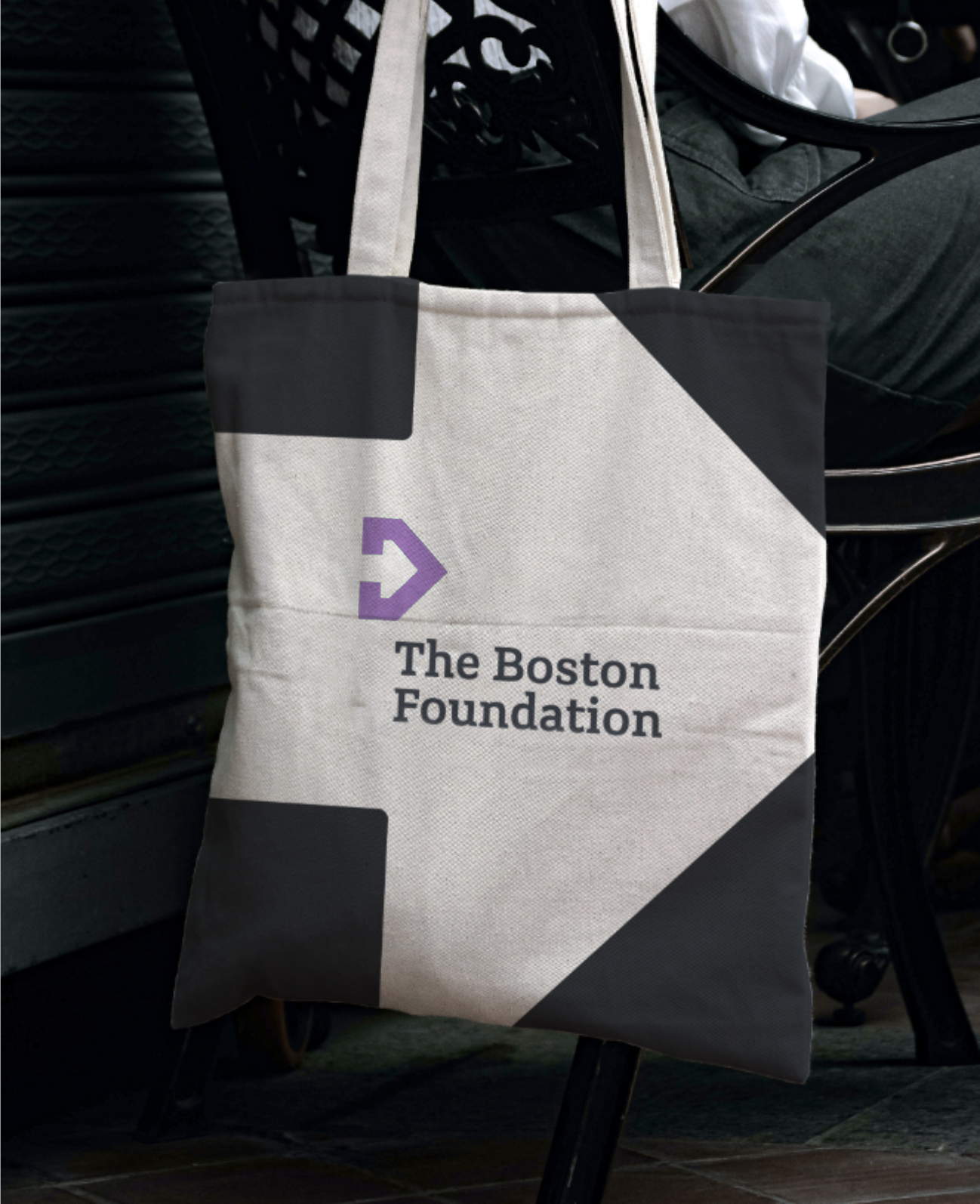
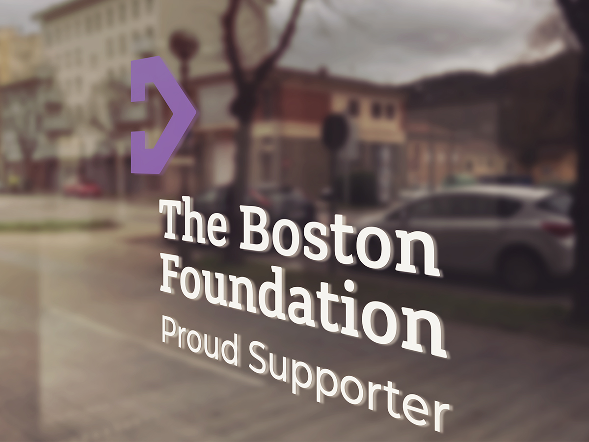
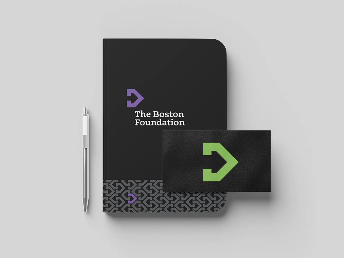
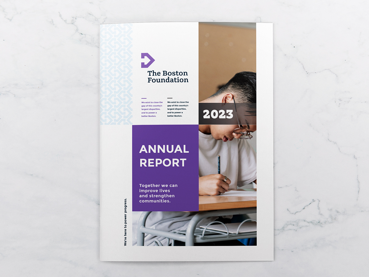
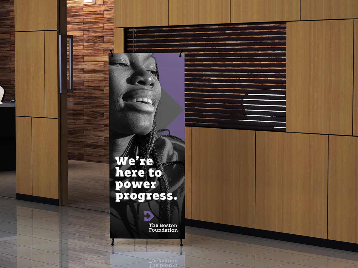
With Move Equity, Move Boston as our central Brand Truth, we developed a visual identity for the brand that is reflective of the visionary, energetic and collaborative vibe of the brand. The logo creates a sense of movement through the use of two arrows, the outer purple arrow and the arrow created by the whitespace inside, emphasizing action, movement and change. Using a slab serif typeface gives the logo a grounded, weighted, confident look and feel. This typeface reflects the institution’s overall brand and credibility. The color palette is at once vibrant and sophisticated, bringing a contemporary feel to the brand, while introducing new flavors of the Boston Foundation’s legacy blue and gold colors.
